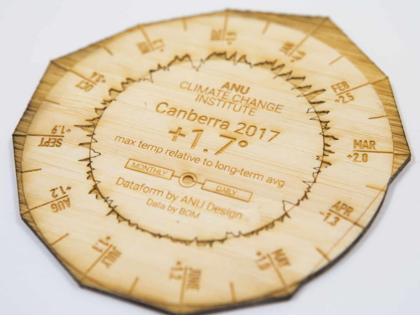
ANU Climate Coaster
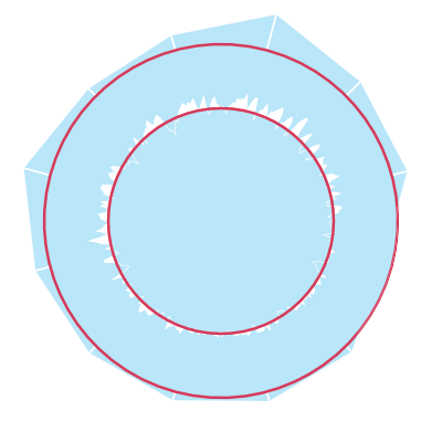
A. Long-term average
The inner and outer rings represent the selected region’s long-term average derived from maximum daily temperature readings for the period 1961-1991.
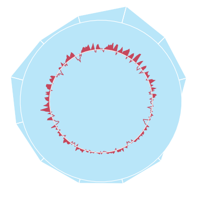
B. Daily max temp
The inner graph represents the selected year’s daily maximum temperatures relative to the long-term monthly average maximum temperature.

C. Monthly average
The outer edge represents monthly averages derived from the daily maximum temperatures relative to long-term monthly average.
Timeline

Controls


About
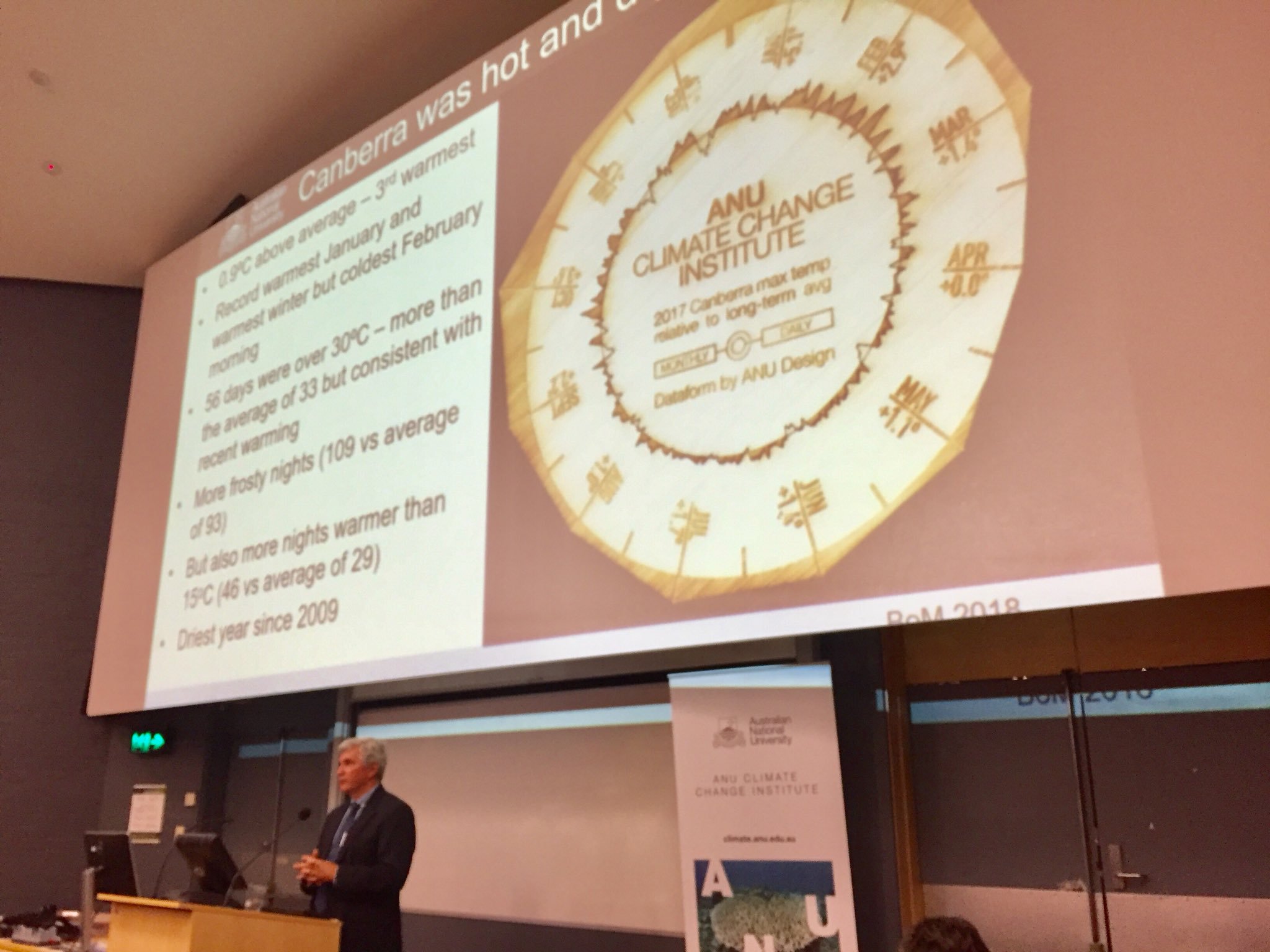
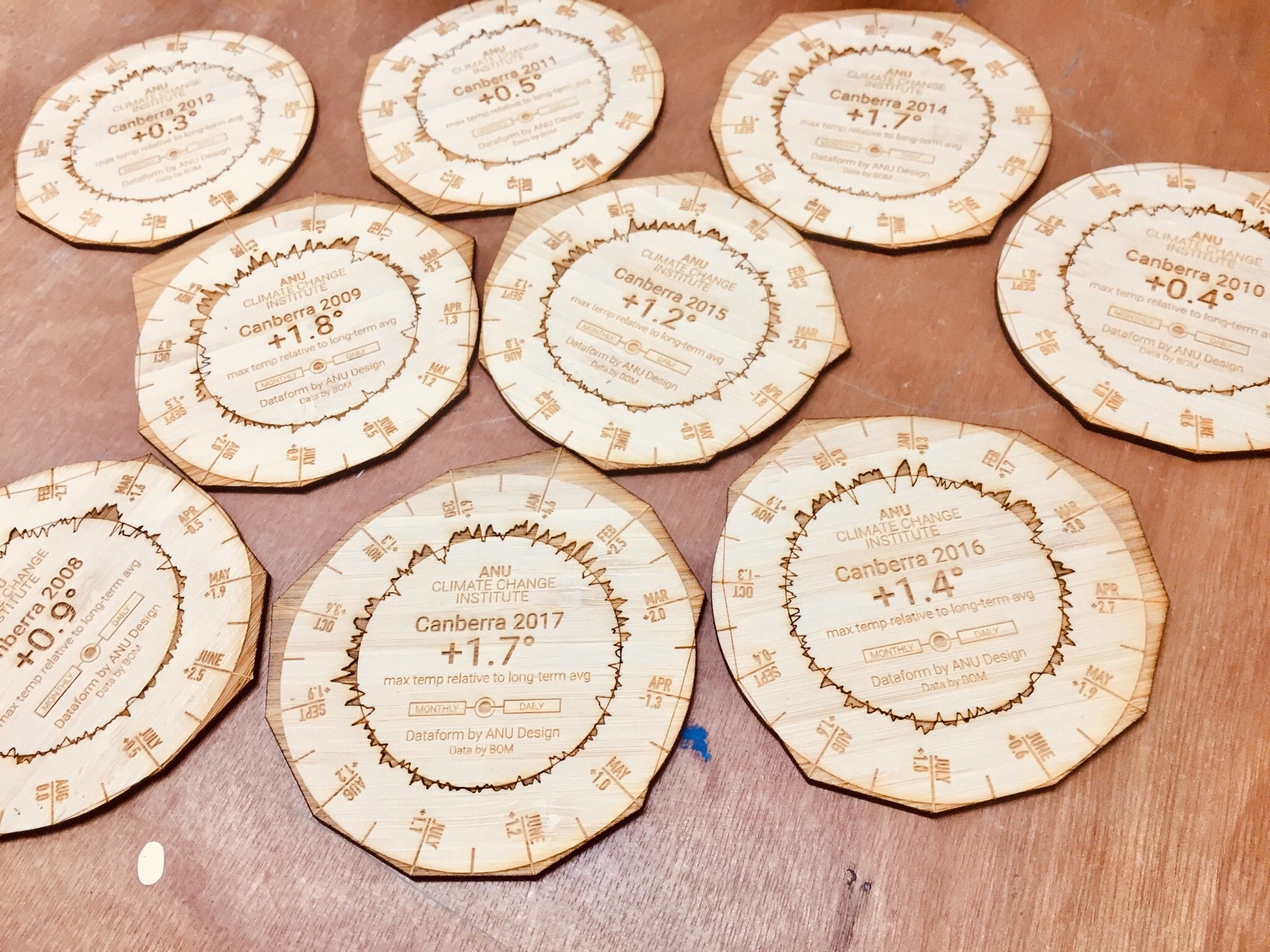
The ANU Climate coaster is a collaboration between the ANU Design Lab and the ANU Climate Change Institute. The work uses the Bureau of Meteorology’s ACORN-SAT dataset to represent maximum daily temperatures relative to long-term averages for 112 different locations across Australia.
Geoff Hinchcliffe and Mitchell Whitelaw produced the work for ANU Climate Change Institute’s Climate Update 2018. The coaster represented Canberra’s 2017 temperature data in a novel tangible form. The compact dataform could be read as a graph but also explored through touch and even smell. Its physicality offered a compelling way to comprehend the data; to feel the peaks of 2017’s record-breaking maximum temperatures. The coaster elicited enthusiastic audience engagement and lively conversation which motivated production of a second version localised for the CCI’s Brisbane edition of the Climate Update.
The title of the work draws on its physical similarity to a drink coaster. We hope that printed coasters will occupy coffee tables across Australia and spark conversation and reflection on our rapidly changing climate.
The ANU Climate Coaster project is generously supported by the ANU School of Art & Design and the Research School of Humanities & Arts.